General Usage
Some user interface elements are used in different places but have the same or at least a very similar function. Common elements are explained here.
1 Search Bar
Most Neowise panels have a search bar which is located in the top bar. The search is executed when the user presses the search button or presses enter while typing in the search bar input.

Filtering is available if the window contains a special filter bar. Filter criteria can be hidden if needed.
2 Selection in Grids
Most grids have a checkbox column for selecting rows. You need to click on the checkbox for selecting or deselecting a row. The header contains a checkbox as well. Clicking it will select all displayed rows or deselect them again.
3 Context Menu on Record versus Context Menu in Header
Neowise shows three horizontal dots as a button for the context menu. The button in front of an item refers to that one item, whether there is a selection or not. The context menu in the header refers to the selected rows in the grid. If there is currently nothing selected, the button will not do anything.
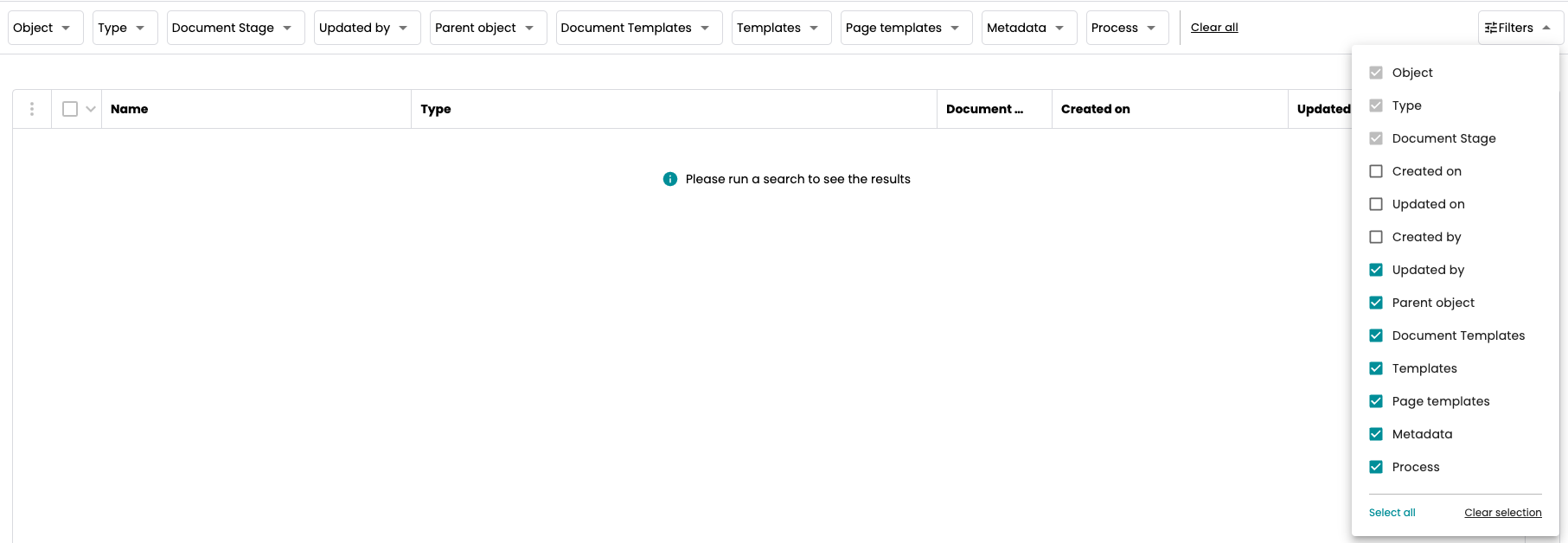
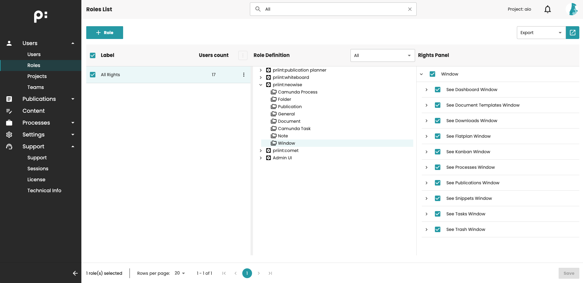
4 Column Chooser
Many Neowise grids have a column chooser  on their right edge. If the user clicks the chooser or the lettering 'X Column Hidden', a list of all available columns is shown.
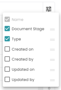
The column checkbox controls whether the column is displayed or not. The order of the columns can be changed by drag and drop in this list. If the grid has columns which must not be hidden, they are shown in light grey and their checkbox cannot be changed.
5 Ordering by Columns
The grid rows can be ordered by the values in the columns. Clicking on the header of a column will order by its values. An arrow will notify about the order. The next click on the same column will change from ascending to descending order. There is a further possibility: ordering by more than one column. This is done using the  button, which appears if the user hovers a column. Pressing it will show the order panel. The user can add the column for either ascending or descending ordering, see which columns are used for ordering currently and remove a column by clicking the column x from the ordering.
6 Pager
Some Neowise windows provide a pager, for easy handling of lists or trees not fitting on the screen.

- The user can select how many rows per page are shown.
- The element says which page and which rows of the page are currently visible.
- Here the user can switch between the pages.
- Entering a number into the Go to Page field activates the given page.
7 Resizing Detail Panel
Each Detail Panel in Neowise can be resized using the resizer. The settings are kept for each Detail Panel. After reopening, the previous width of the Panel is restored. Please note there are maximum and minimum sizes: 50% of the screen width is the maximum, 300px is the minimum.
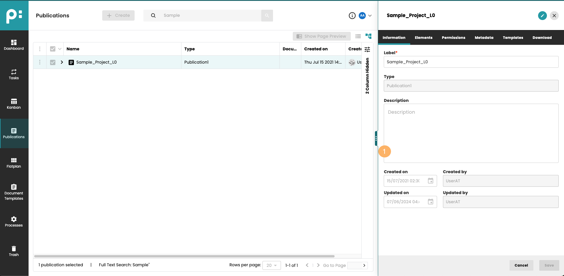
- Resizer
8 Resizing Tree Panels
Similarly to Detail Panels, Tree panels in Kanban and Flatplan window of Neowise can be resized using the resizer. The settings are kept for each Tree Panel. After reopening, the previous width of the Panel is restored. Please note there are maximum and minimum sizes: 50% of the parent's width is the maximum, 180px is the minimum.
- Resizer
Main Window Functions
The left column of the window is the main menu. It shows the priint logo or if customized, the customer logo at the top. Here you reach all windows by clicking the appropriate symbol.
The top bar shows the name of the active window on the left side. On the right side, there is first an information button  referring to the Admin page with versions and license information.
Next to the information button, there is an application switcher menu:
referring to the Admin page with versions and license information.
Next to the information button, there is an application switcher menu:

This menu allows you to switch between the configured applications without re-logging. The chosen application will be opened in a new tab. Moreover, user rights can restrict access to each application using access rights:
At the end, there is the user avatar and a drop-down angle button. Here you can open your own user profile, and logout.
The user profile panel will open on the right side of the window.
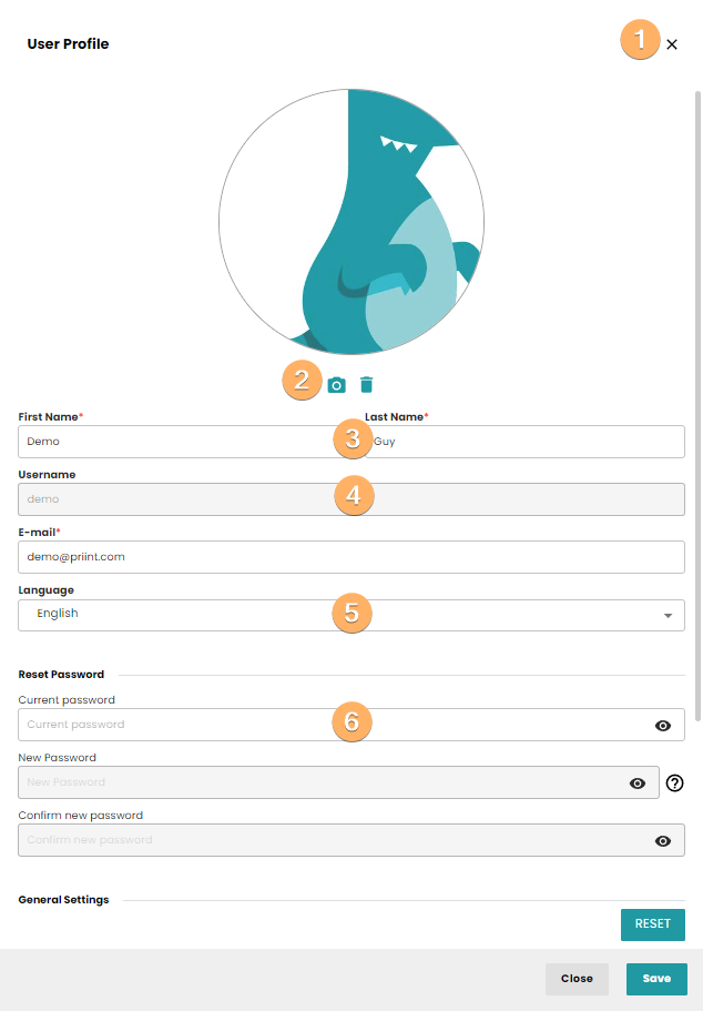
- Clicking the X button will close the user profile panel without saving.
- The user avatar can be set and removed.
- First and last name and email can be changed. The red star adornment on the fields means, that the field is required.
- The username cannot be changed.
- The language used by Neowise can be chosen. Currently English, French, German and Japanese are supported.
- Below the divider Reset Password the user can change her/his own password. The old password must be entered, and the new password even twice. The question mark button will show the hints for the password rules.
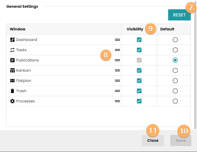
Below the divider General settings, the user can configure the main menu.
- The RESET button will remove the personal configuration.
- The display order of the windows can be changed by drag and drop.
- The checkbox Visibility controls whether a window is included in the menu. The Checkbox Default controls, which window is shown when you first login (or cleaned up your cookies).
- Do not forget to click the Save button, if you changed any setting.
- The Close button will close the user profile panel without saving.
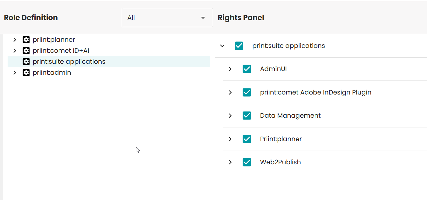
9 Access rights to panels
Please note, it is possible to restrict the access to a given panel by using access rights.
They can be configured in the Admin panel:
If the user doesn't have access to the given panel, the menu item will be hidden. When trying to access the panel by link, the user will get the following message:
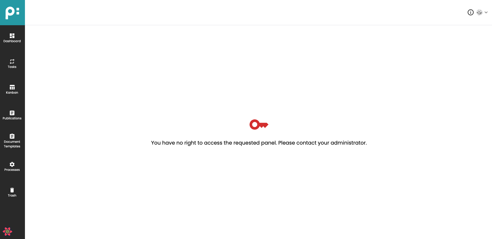 .
.
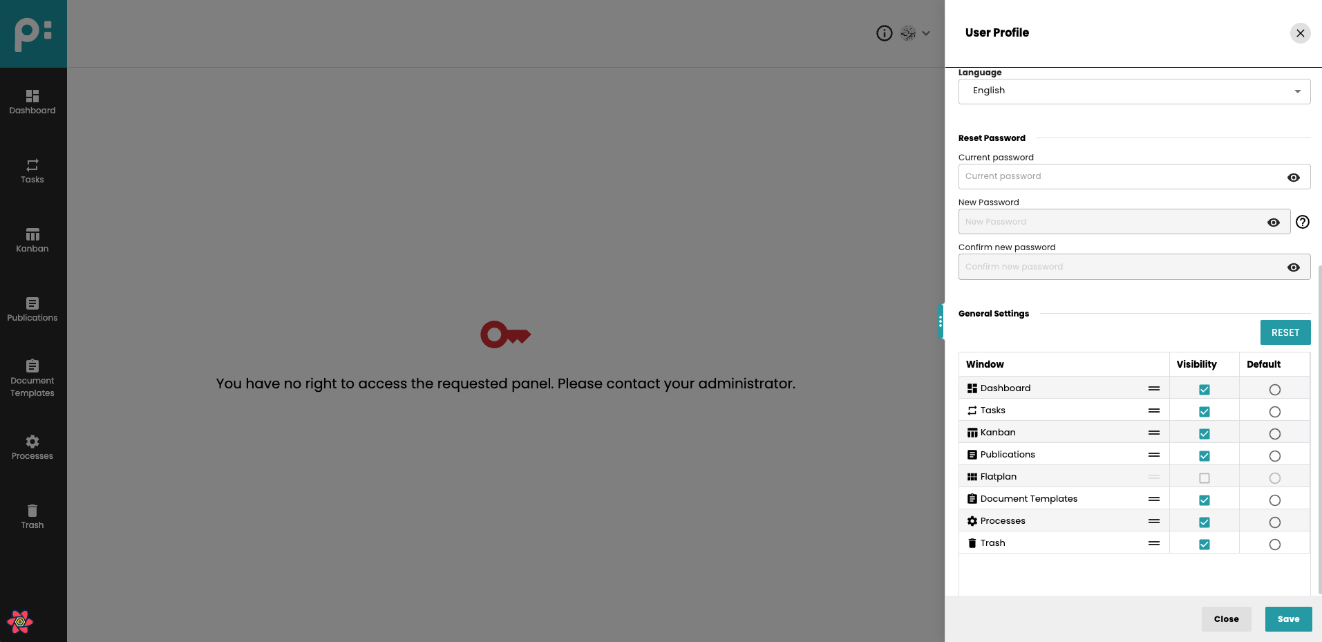
Additionally, the User settings panel will show this panel as disabled:
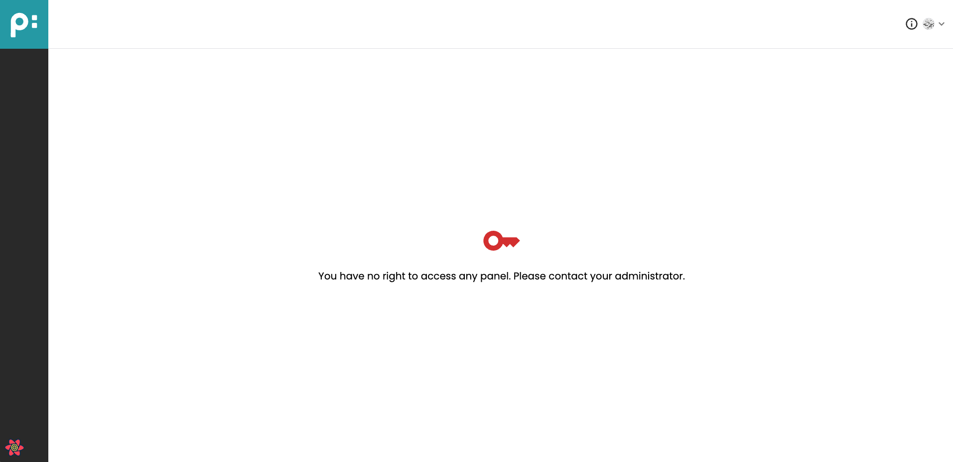
If the user has no access rights to any panel in Neowise, no menu items will be displayed and the following will be shown:
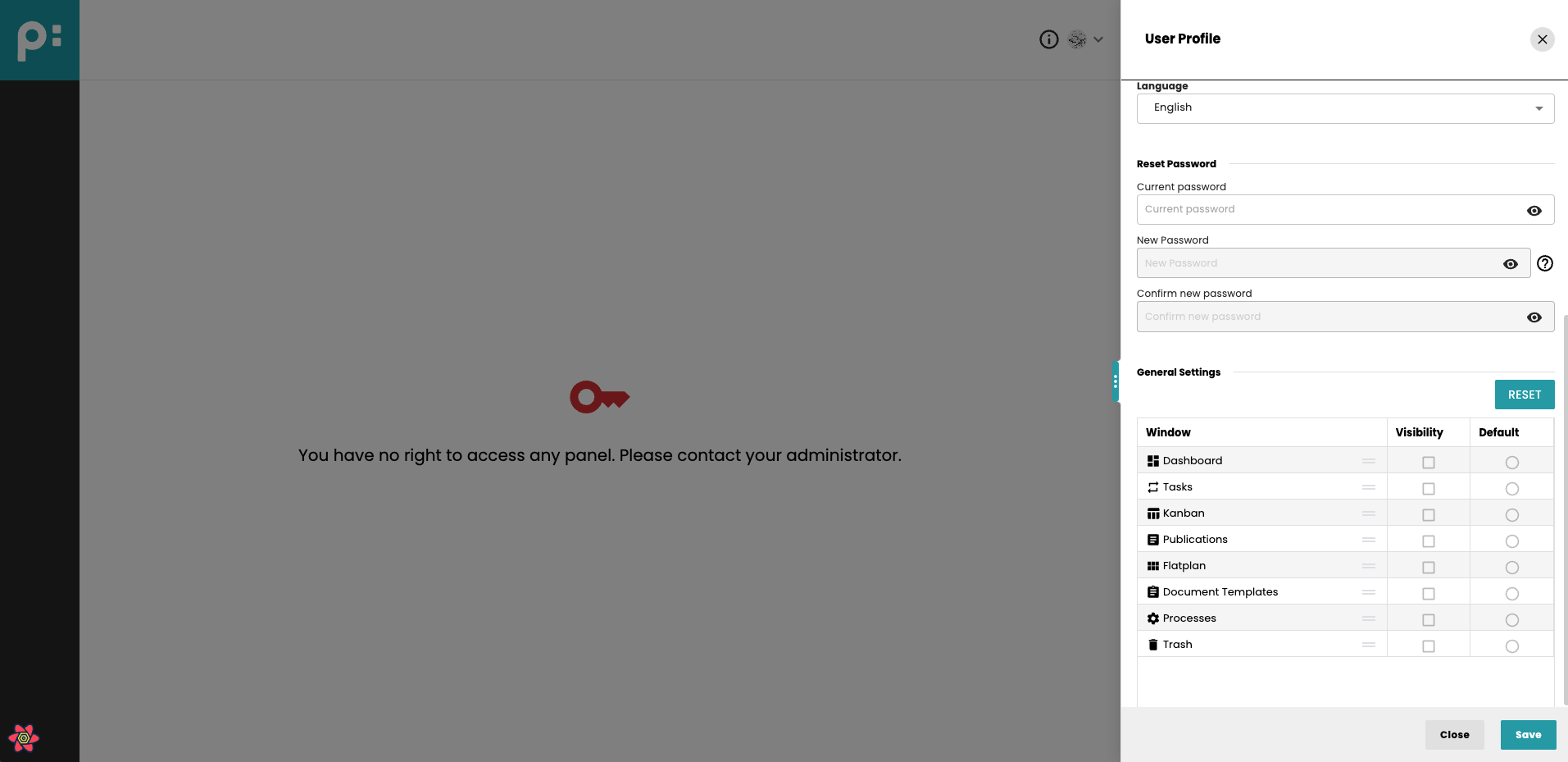
User settings panel will show all panels as disabled:
10 Collaborative Editing and Document Locking
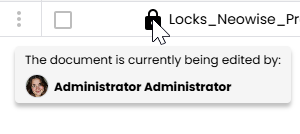
Only one user can edit a document in the Flatplan Stage at any given time. When a user opens a document in Flatplan Stage, the application automatically updates its state and places a lock on the document to prevent others from editing simultaneously, which is signalled by the lock icon:
Hovering over the icon triggers a tooltip with the names of the users editing the document at the moment:
It is not possible to change the stage or document type of a document that is currently being (co-)edited by another user. This restriction applies across all stages to ensure data integrity.
10.1 Multi-User Editing in Review Stage
The Review stage is the only stage where multiple users can collaboratively edit the same document at once. When the document is open in Review by at least one user, the lock icon displays in the primary color to clearly indicate active collaboration:
Inside the Stage, the avatars of the users editing the document are displayed on the toolbar:

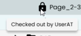
10.2 InDesign Desktop plugins locks
When a document is being edited (checked out) in the InDesign Desktop plugins, it becomes locked in priint:planner, and vice versa. In priint:planner, the lock icon tooltip indicates who opened the document:
10.3 Starting processes for locked documents
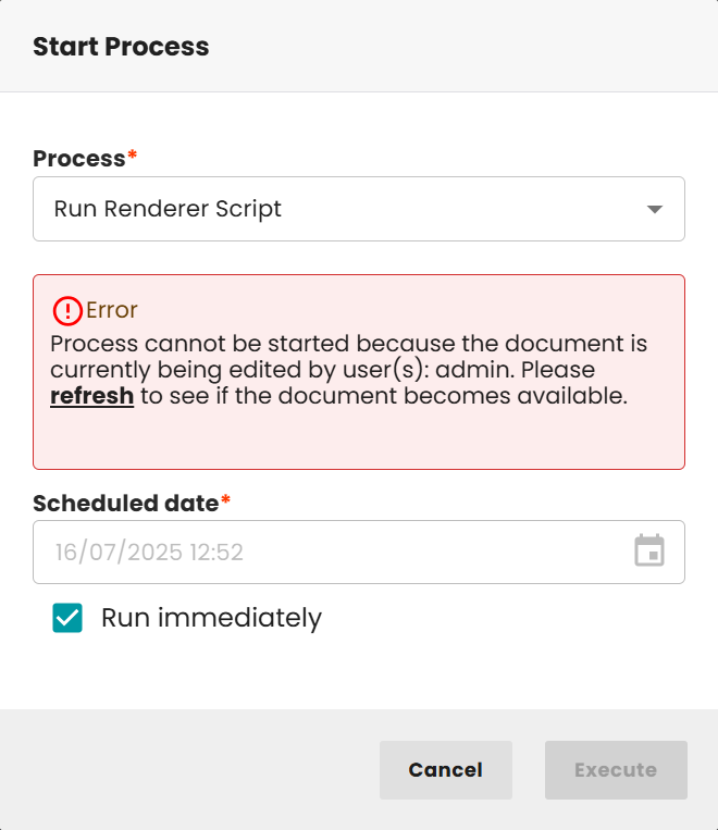
When executing a Camunda process in Flatplan, the system checks the current document lock status, especially during the Review stage. If the document is being edited by multiple users at the same time, only processes that do not include rendering tasks are allowed to be started. However, if the document is either not locked or is currently being edited only by the user attempting to execute the process, all types of processes can be run, regardless of the stage.
In situations where a document is locked by other users, a dialog will appear, informing the user who is currently editing the file. This dialog includes a “Refresh” button, allowing the user to manually re-check the document’s lock status. If multiple documents are selected, the dialog simplifies the information and shows only the number of locked items, without specifying detailed lock information for each. In case an error occurs during the status check, a detailed error message is shown along with the same option to refresh.
To avoid conflicts, the standard refresh button from the dynamic UI will be removed from default methods. Instead, the lock status of the document is automatically verified again after the user clicks the execute button.
⚠️ This lock-handling functionality applies exclusively to documents; publications, folders, and standalone processes are not affected by this logic.
10.4 Unlocking
In case of an unexpected error or other situations where the document locks needs to be cleared, there are additional options to unlock the document:
- Admin can unlock the document for all users and applications.
- Any other user, can remove his/her lock.